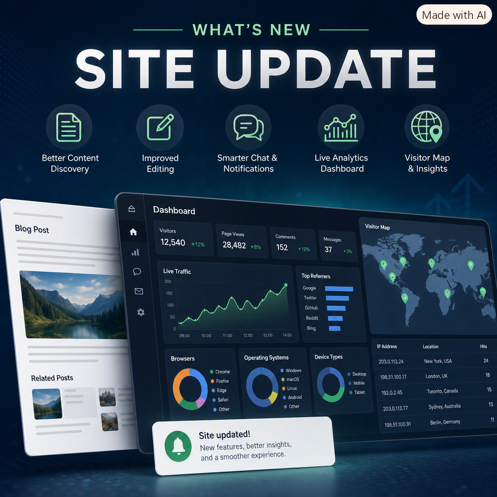
Since 9/21/2026, I’ve been making a series of focused improvements to the site to make it easier to discover content, better optimized for sharing, smoother to edit, and more useful in the admin area. The updates touched post presentation, SEO, chat moderation, live analytics, and the dashboard.
Better post discovery and sharing
One of the biggest improvements was on the blog post detail page. Posts now surface related content based on shared tags, which makes it easier to keep reading without having to go back to the homepage. The related-posts section is designed to stay relevant to the article you are already viewing, and it excludes the current post so the suggestions feel useful instead of repetitive.
I also added stronger social and search metadata to each post. That includes Open Graph tags, Twitter Card tags, and JSON-LD structured data for BlogPosting. In practical terms, this helps the site generate richer previews when links are shared and gives search engines a clearer understanding of each article.
A better editing experience
The post editor now gives a much better writing experience. Instead of editing blindly, the body editor includes a live preview pane so changes can be checked immediately while writing HTML content. That makes it easier to catch formatting issues early and reduce the back-and-forth between editing and previewing.
The editor also supports post metadata more cleanly, including a dedicated summary field for search engines and social sharing. That keeps the content structure more organized and makes publishing new posts faster.
Comment notifications and chat improvements
I updated the discussion and chat experience as well. Authors can now receive email notifications when new comments are posted, if notifications are enabled. That makes it much easier to stay on top of conversation without constantly checking the site.
The chat system also received several moderation improvements. Admins can search chat messages, soft-delete messages instead of removing them outright, and bulk-delete entire sessions when needed. On top of that, typing indicators were added so the chat feels more responsive and conversational.
Dashboard updates
The admin dashboard got the most visible change this week. It now uses a mix of live
analytics and charting to show how the site is performing in real time. The dashboard
charts are built with Chart.js using HTML <canvas>
elements, and the data is pulled from controller endpoints that return JSON. That makes
the charts lightweight, responsive, and easy to refresh without a full page reload.
Chart examples
The dashboard includes several chart types, depending on the data being visualized:
- Line charts for live traffic trends.
- Doughnut charts for category breakdowns like browsers, operating systems, and contact status.
- Bar charts for rankings such as top referrers or top content.
Here’s the general pattern used for a live line chart:
const liveHitsCtx = document.getElementById('liveHomepageHitsChart').getContext('2d');

const liveHomepageHitsChart = new Chart(liveHitsCtx, {
    type: 'line',
    data: {
        labels: [],
        datasets: [{
            label: 'Hits',
            data: [],
            fill: true,
            backgroundColor: 'rgba(25, 135, 84, 0.1)',
            borderColor: 'rgba(25, 135, 84, 1)',
            tension: 0.3,
            pointRadius: 2
        }]
    },
    options: {
        responsive: true,
        plugins: { legend: { display: false } },
        animation: { duration: 0 },
        scales: {
            x: {
                ticks: { maxTicksLimit: 10, maxRotation: 0 },
                title: { display: true, text: 'Time (UTC)' }
            },
            y: { beginAtZero: true, ticks: { precision: 0 } }
        }
    }
});
The live dashboard data is refreshed from the server with fetch(), then
rendered into the chart without a page reload:
async function refreshLiveHomepageHits() {
    const response = await fetch(`/Admin/LiveHomepageHits?range=${encodeURIComponent(currentRange)}`);
    const data = await response.json();

    liveHomepageHitsChart.data.labels = data.map(d => d.time);
    liveHomepageHitsChart.data.datasets[0].data = data.map(d => d.count);
    liveHomepageHitsChart.update('none');
}
That same Chart.js setup is used for the other admin charts too, including:
- Views over time
- Top posts
- Contact message status
- Posts per month
- Browsers
- Operating systems
- Device types
- Top referrers
On the server side, the controller prepares the chart data by grouping and aggregating records from the database before serializing them to JSON for the view. That keeps the browser code simple and makes it easy to swap chart types or add new dashboard panels.
World map example
Another major addition is the world map for visitor IPs. That page uses Leaflet with OpenStreetMap tiles to render a full interactive map in the browser. The goal is not weather or radar data — it is to show where visitor IPs have been seen, let me search by IP, and sort by how often an IP has visited an endpoint.
The map page is split into two parts: a sortable IP list and the map itself. The list shows recent IPs and the map places markers at the resolved coordinates.
Here’s the basic Leaflet setup used for the map:
const map = L.map('worldMap', { worldCopyJump: true }).setView([20, 0], 2);
const markerLayer = L.layerGroup().addTo(map);

L.tileLayer('https://{s}.tile.openstreetmap.org/{z}/{x}/{y}.png', {
    maxZoom: 18,
    attribution: '© OpenStreetMap contributors'
}).addTo(map);
Each IP is resolved to location data on the server and then passed to the view as JSON. The controller groups homepage hits by IP, sorts them by either recency or count, and looks up latitude and longitude through a geolocation service.
That looks roughly like this in the controller:
var recentHits = await hitsQuery
    .OrderByDescending(h => h.Timestamp)
    .Select(h => new
    {
        h.IpAddress,
        h.Timestamp,
        h.Path,
        h.Slug
    })
    .ToListAsync();

var recentIps = recentHits
    .GroupBy(h => h.IpAddress!)
    .Select(g => new
    {
        IpAddress = g.Key,
        LastSeenUtc = g.Max(x => x.Timestamp),
        HitCount = g.Count(),
        Path = g.OrderByDescending(x => x.Timestamp)
            .Select(x => x.Slug != null ? $"/Blog/Post/{x.Slug}" : (x.Path ?? "/"))
            .FirstOrDefault()
    });
After that, the server resolves each IP to a location and returns the data to the browser:
var location = await _worldMapLocationService.ResolveAsync(hit.IpAddress);

return new WorldMapIpViewModel
{
    IpAddress = hit.IpAddress,
    LastSeenUtc = hit.LastSeenUtc,
    HitCount = hit.HitCount,
    Path = hit.Path,
    City = location?.City,
    Region = location?.Region,
    Country = location?.Country,
    Latitude = location?.Latitude,
    Longitude = location?.Longitude
};
The browser then renders those IPs as markers and keeps the list in sync with the map. Search filters the list by IP, and sorting can be changed between most recent visits and highest hit count. The end result is a practical geo-analytics view that makes traffic patterns much easier to understand.
Why this matters
The map is especially helpful because it turns raw logs into something visual and actionable. Instead of looking at rows of IP addresses, I can immediately see repeat visitors, the regions they appear from, and which endpoints they are hitting most often.
Overall result
Taken together, these updates make the site feel more polished across the board: better previews when sharing, better guidance while writing, better tools for managing conversations, and a much more informative dashboard. There is still more I want to refine, but the site is in a noticeably better place than it was on 9/21.
Thanks for reading, and thanks for following along as I keep improving the site.
Comments (0)
Please sign in to comment.